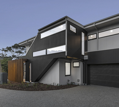
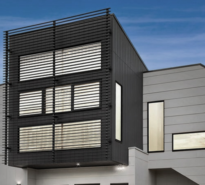
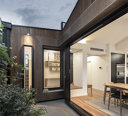
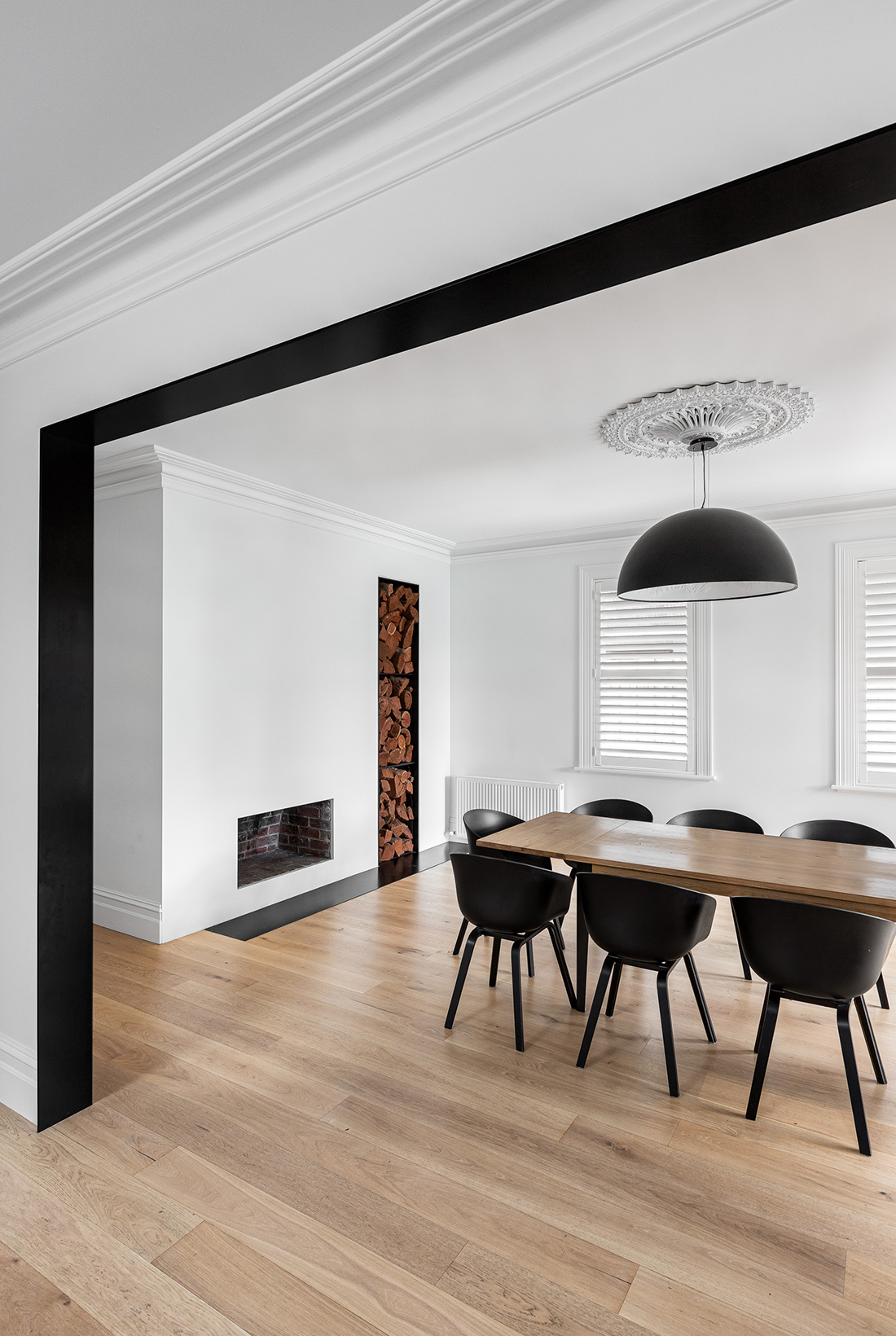
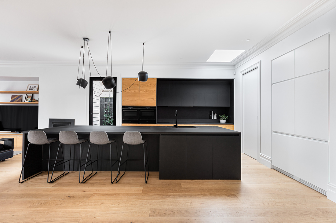
A young family of four had a house of their dreams in the location of their dreams, but what they didn’t love were the dark and fragmented spaces of their much loved Williamstown home. Working within the footprint of the already large single storey home, Dig Design has created a light and open home that really has made their architectural dreams come true.
Type: Alterations + Additions
Location: Williamstown
Client: Carmel + Jamie
Build: Madeform
Photography: Daniella Fulford
Dig Design was asked to create a family home suited to a contemporary lifestyle. There needed to be better connection between spaces, looking at where people naturally congregated within the home. It called for a contemporary architectural style to create a stimulating place to call home.
The existing house was fragmented with many detached spaces, with very strong design choices having been made by previous owners. We wanted to make the house work as efficiently as possible, making the most of it’s large footprint without the need to extend, we believed we could refurbish and reinvigorate the home.
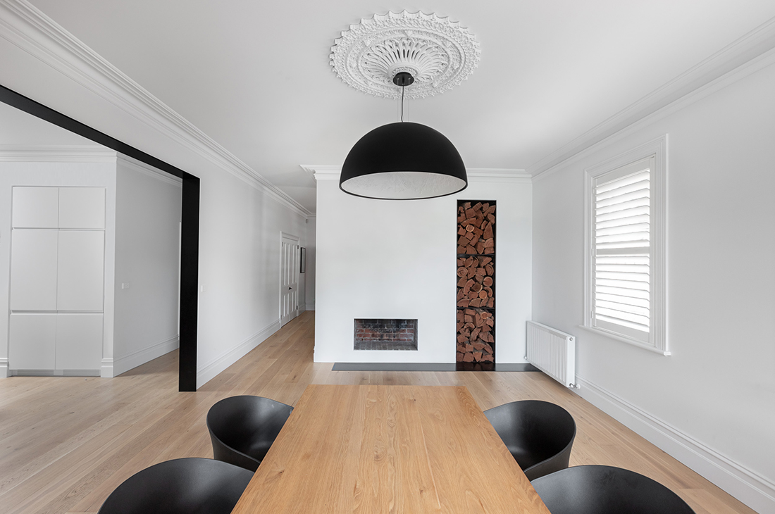
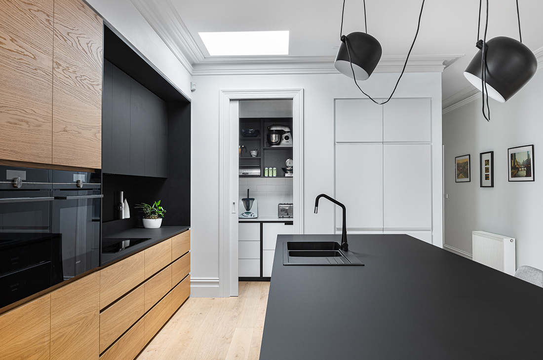
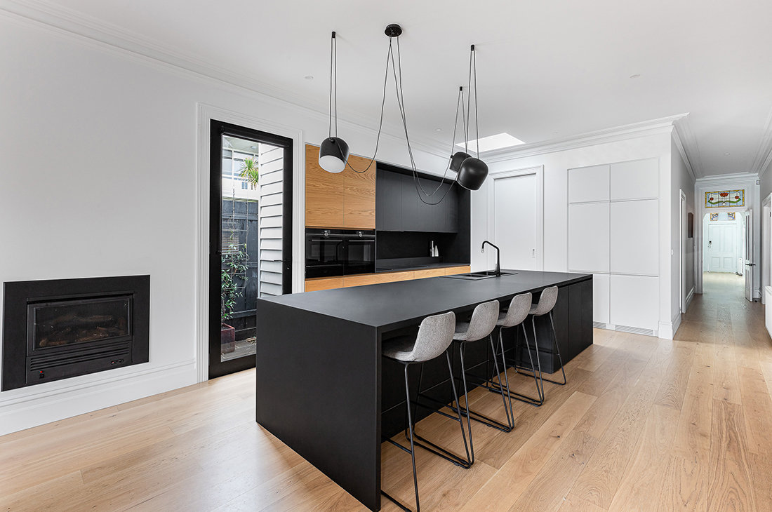
The kitchen is the heart of the design, it is a focal point with both the living and dining opening onto it. The contemporary black kitchen was critical as a design focus and finishes used throughout the house are designed to supplement and unify the home. Top of the client’s wish list was the removal of what they called the salmon room (a very dark ochre painted dining room) as well as removing the terracotta tiles from the floors which was the initial impetus for the project.
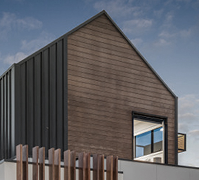
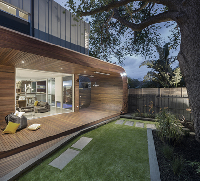
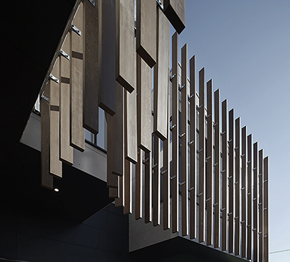
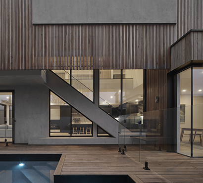
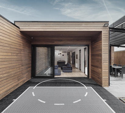
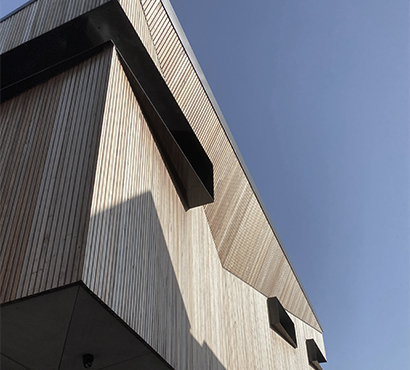
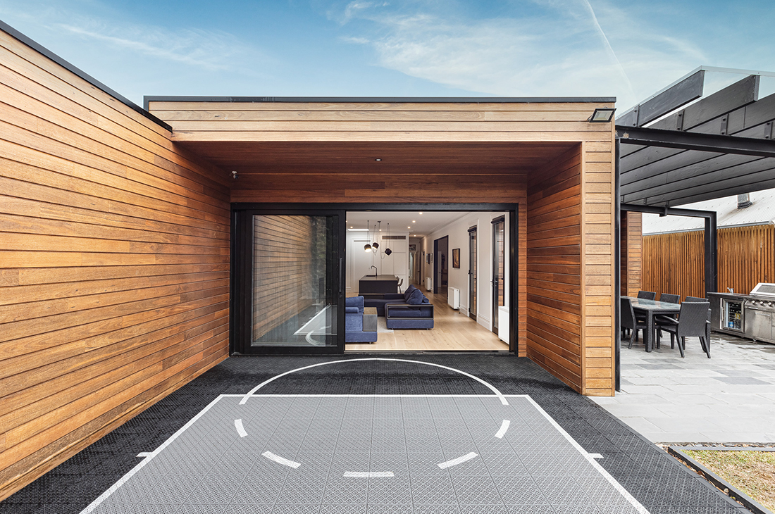
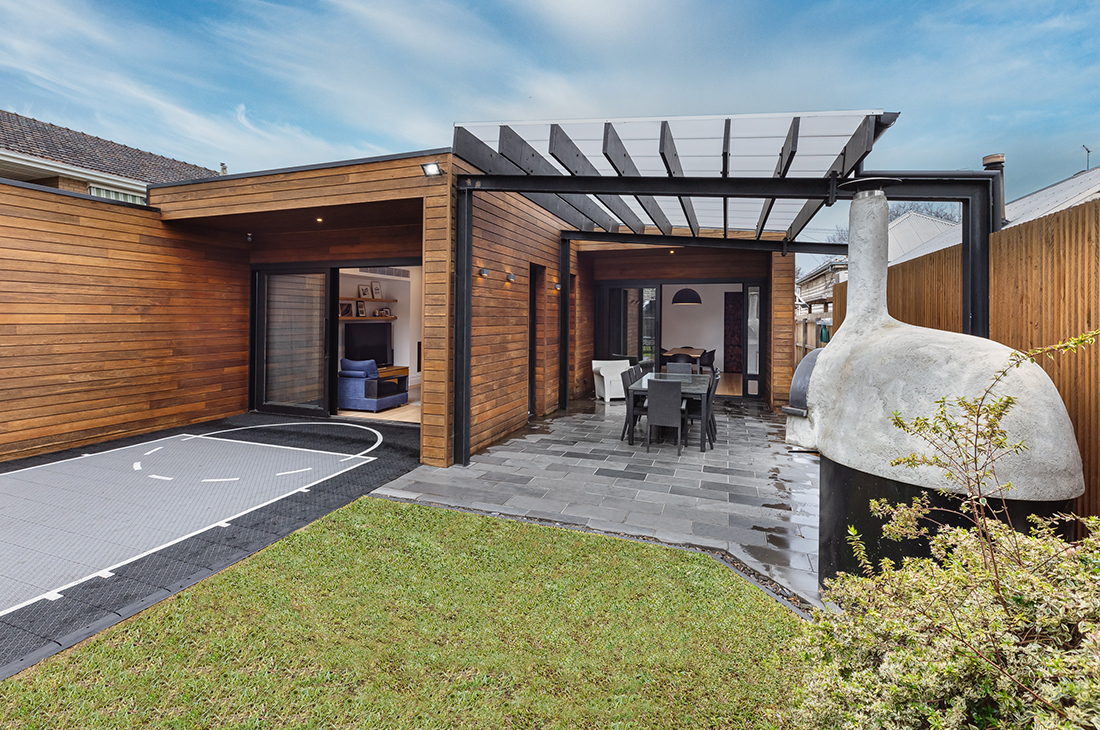
It was important to connect the inside and outside of the house and improve the flow of the home. We opened up the back of the house substituting French doors with stacking sliding doors. An alfresco dining area was created and became a transitional space to the backyard. The existing exterior was bag rendered which we replaced with shiplap cladding, making some modifications to the form of the rear of the home at the same time.
continued …
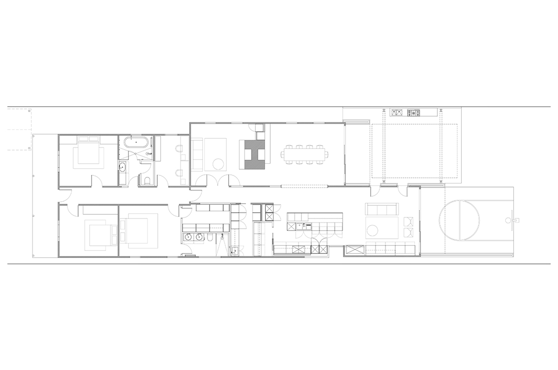
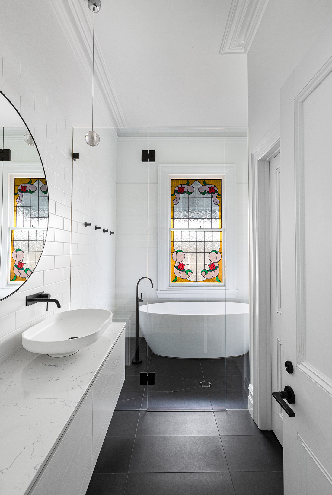
The four bedrooms in the house were retained and new finishes tied these areas to the rest of the home. The service areas were redesigned to create a walk-in-robe, ensuite, laundry and walk in pantry. By making the design more efficient we were able to create extra spaces and make the rooms feel larger.
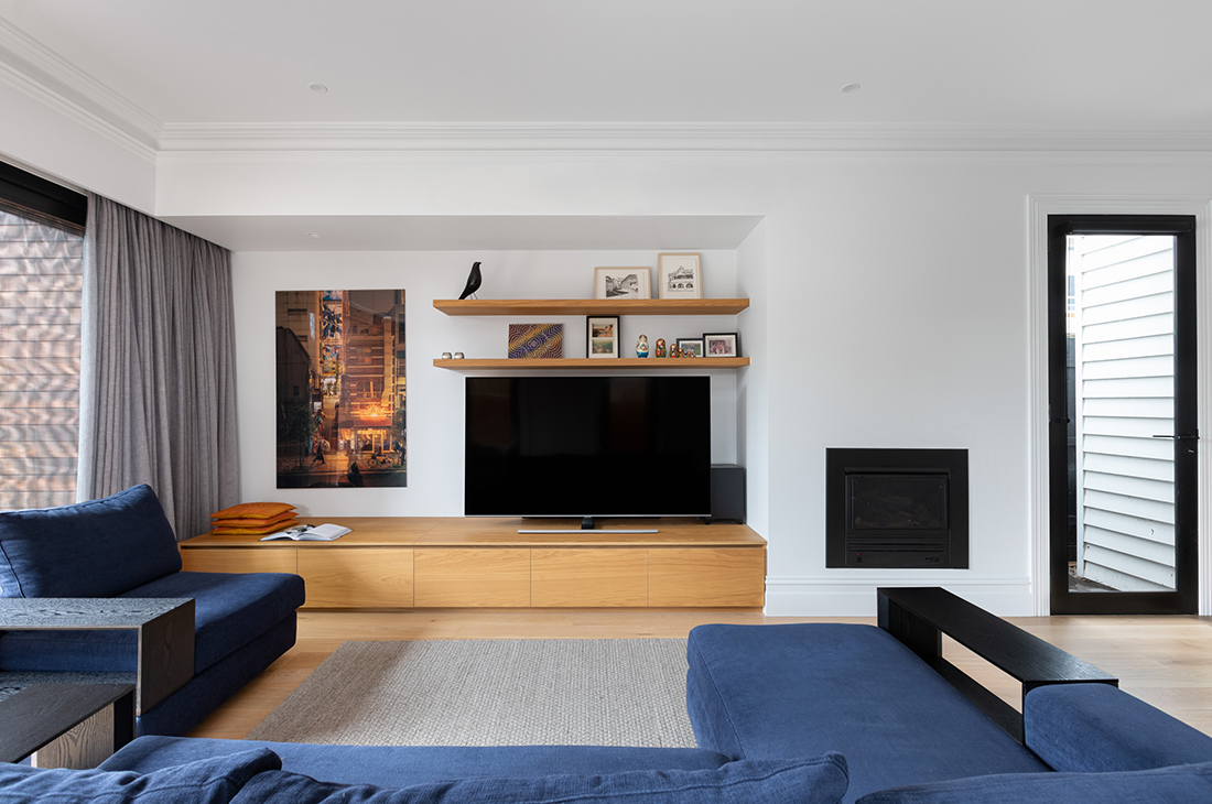
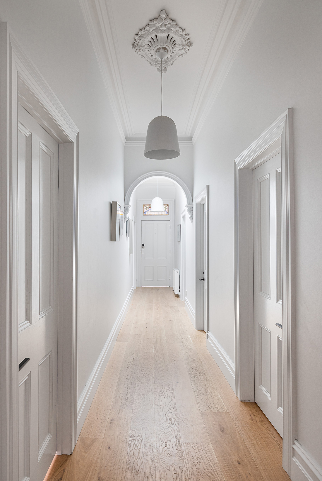
New floor boards throughout the house and strong black detailing and complimentary colours enabled us to bring the whole project together as a cohesive home, without moving a single external wall.
It is with great pleasure that we recommend Julie-Anne & Lindsay from Dig Design without reservation for their architectural and interior design brilliance in renovating our home.
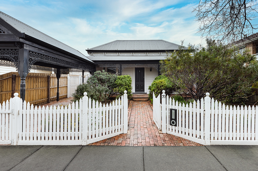
We engaged Julie-Anne & Lindsay to transform our 1890’s Victorian home and design a renovation that would suit the needs of modern family living.
The Dig Design team led the process, overseeing tenders with the builders, and creating a design that both respects the home’s heritage, reflects a contemporary aesthetic that we love and is highly functional.
The process itself was incredibly well managed with regular onsite meetings between ourselves, the builders and Dig Design that ensured our large scale renovation was completed ahead of time and in budget.
The Dig Design team were very responsive and accessible to discuss every design element which helped us feel confident and supported throughout the process.
We have been in our renovated home for nearly two years now, and still love coming home and entertaining with family and friends.
– Carmel+ Jamie, Williamstown

Find out more on how Dig Design is the right fit for you and your project.
Contact us today to take advantage of our complementary initial consultation to discuss the possibilities in your project.


